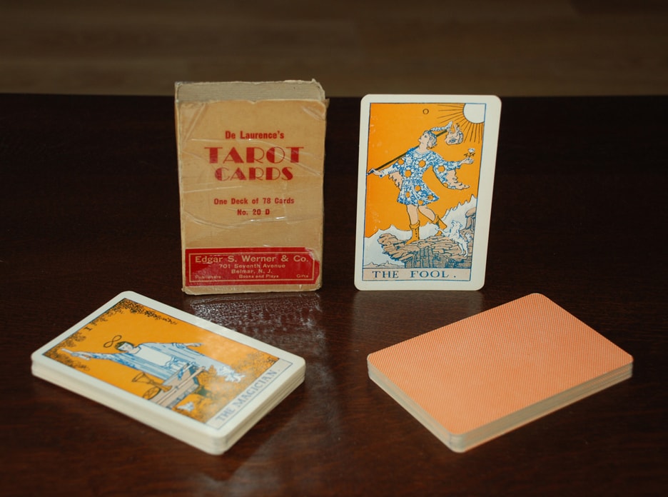
de Laurence’s “orange” tarot deck
The “orange deck” . . .
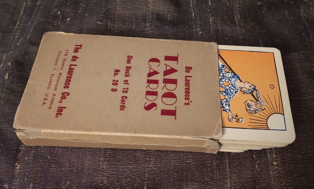
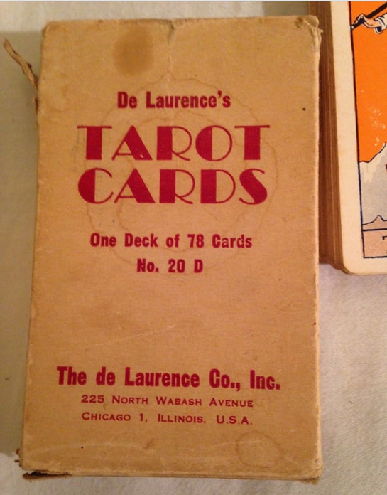
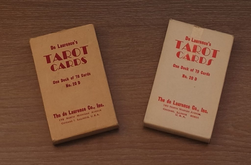
L.W. (he let’s me call him that) never got to see this deck. All evidence points to the fact that it was first printed by his son, Velo, who printed the “round yellow” decks starting in late 1943 or soon after, and then changed the color from yellow to orange around 1954. In the orange decks we see that the quality was still high (for the first run anyway), but later printings at two different relocations of the de Lawrence Company headquarters produced varied quality results. This deck was first printed when the de Laurence Company was located at 179 North Michigan, where they had existed since before 1931. A second edition of this orange deck was printed while the de Laurence Company was briefly located 225 North Wabash avenue, around October of 1956. The final orange version of the de Laurence co.’s “No. 20 D” was printed when the company settled into their new address at 180 North Wabash, where they stayed for many years. The “de Laurence red” was also printed when the company was at this address.
People often mistake the red deck for the orange. This is because some of those have strong reds and others have a reddish orange hue that is not as bold as the orange deck. In these decks the orange starts out closer to yellow; almost a pale orange (please see featured image above), and in later versions the orange is more of a dark tangerine color. Look at the faces of the trumps, especially The Empress. In early orange decks her face is close to a Caucasian flesh color, but in later editions she looks as if she has been hitting the tanning booth too hard. There is also speculation about the blue/indigo color difference. This is a matter of different print runs, and possibly even different printers using the same standard playing card stock. In the red decks however you can tell instantly the more reddish color of the pattern on the back of the cards. As to value, the decks printed at 179 North Michigan are the oldest, but the ones printed at 225 North Wabash are the most rare. Most of the orange decks look to be printed at the Michigan address, followed by one or two print runs at the 180 North Wabash address, and only one print run at 225. This is all scientific speculation of course; based on known evidence but lacking the actual receipts to prove this beyond a reasonable doubt. Still, if you come across a de Laurence orange with a box that says 225 North Wabash at a reasonable price, you should grab it. These decks came with a white or red “extra card” (used as a spacer for a snug fit in the box). Many of the boxes from this time split at the seams due to the increased thickness of the cards from the yellow versions. Take great caution in forcing your cards to fit inside the box after taking them out so they do not get damaged. (This comes from personal experience working with several de Laurence decks). Also, decks with boxes that are not split or ripped are extremely rare, so if you have one please preserve its condition for future generations.
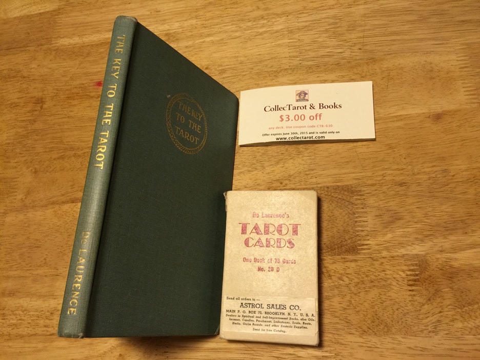
Publisher: de Laurence, Scott & co.
Pub dates: circa 1955–1962
Designer: Arthur Edward Waite,
L.W. de Laurence, Velo de Laurence
Artist: Pamela Coleman Smith
Colors by: Velo de Laurence
Stats:
Size: 121.5 x 74.5-75.5 mm
Thickness: 20.5 mm
Weight: 202 grams
Cost: $3.50
Came with: White box and L.W.’s IKtT

Please click on the image to see it full-sized, or on the arrows to scroll through the various pictures.
Here are some images of various “orange” decks from different collections. Note the different addresses on the boxes. These represent different times in the De Laurence co. history, and it is most likely that the poor quality orange deck version was the result of having to change printers. This would be beyond the ability of the De Laurence co. to fix. We can see that this problem (print quality) plagued Rider & Co. with the “D deck,” in the 1920’s.
Rather than strain your eyes, come see our web-friendly scanned images of this deck here. If you need high-resolution scans of this deck for research purposes, or for your university, county, or national museum, please contact us!
New information
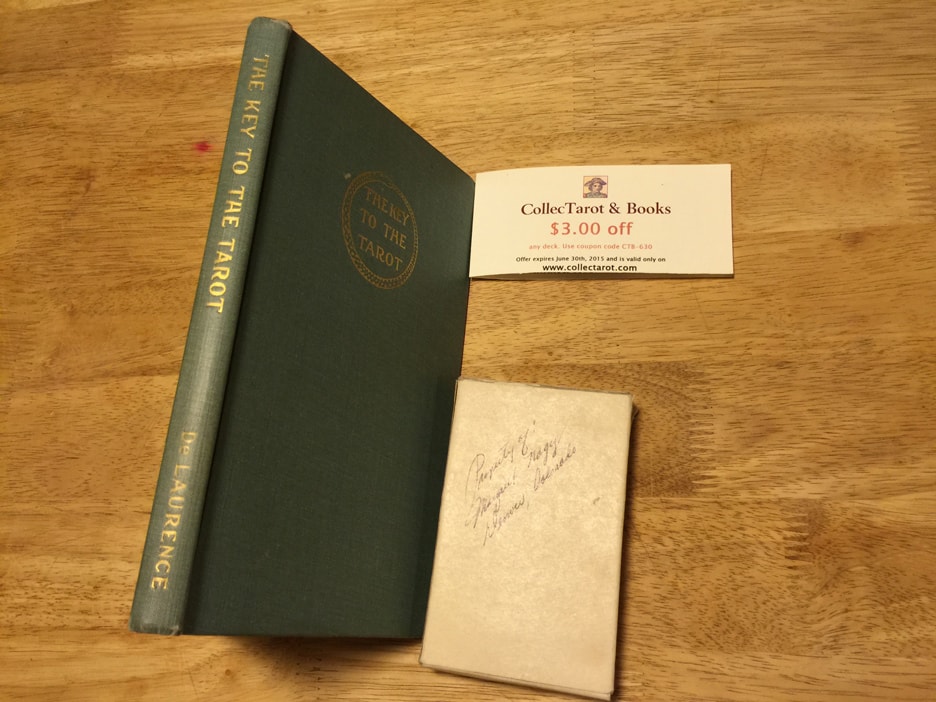
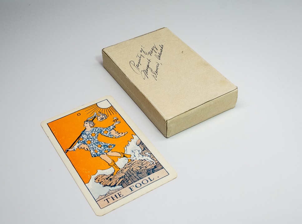
The orange deck I purchased from Bolaris came with an IKtT (dated 1918, like all non-1918 IKtTs). The purchaser (original owner) signed both at the same time upon getting them home. This pairs THIS IktT with THIS orange deck sold by THIS store (Astrol Sales Co.) in Brooklyn. If Astrol Sales was only in business for a short time this would narrow down the date range, but I think more important than that is the fact that the de Laurence Company had a strong distribution network outside of their catalog for both their books and their decks. Also please note the lack of a zip code or city postal code on the sticker. I will continue to research this. All input is appreciated.