Rider “B deck” (estimated 1931 through 1939)
Hmmm . . . where to begin on this one? Well, the term “B” deck is a bit misleading, so let’s begin with that. Oh yeah, if you want to skip to the huge gallery of images below, please click here to scroll down, as there will be a lot of words on this page. Frank Jensen is the lead researcher on this project and a lot of what we know now comes from his diligence and patient persistent labors to compile the history of these modern decks, and the efforts he has inspired in us over the years to “beat the old man to new secrets.” This is not to say that the brilliant work by Michael Dummett, Ronald Decker, Thierry Depaulis, and a handful of other dedicated scholars is substandard in any way. But as to tracing specifically the production timeline, methods, and “who did what and when,” Frank is the man.
For several years Frank produced the Manteia Courier, simply the best magazine on the tarot ever. In the inaugural issue (1999) Frank gave the (then five—but the fifth turned out to be the de Laurence Square Yellow deck) “four” decks their names, and those names have stuck, and grown in global usage, ever since. He labelled these in the order that he discovered them. This was before the rediscovery of the 1909 version (the R&L deck) . Those decks existed, and certainly more do as well, but they were simply “tarot decks” in the hands of collectors and descendants of the original owners, and not known to the public (or Frank—yet). So the “B” deck is named “second in line” meaning it’s rediscovery, but our research team is almost unanimous that this deck was third or fourth in the order of production. We like to disagree on this particular point and someday we may have to solve this on the field of honor. 🙂
What is known is that this “B” deck came with later editions of the Keys (or Key’s to the Tarot or KtT’s) dated 1931, or undated. As of this writing (late 2015) there have been several “B” decks recorded and registered but none have come with a 1910 or 1920 KtT. This, and the various clues presented below are the driving force behind the presumption that the “B” deck was either second, third, or fourth in the series of decks produced by William Rider & Son, Ltd. (later Rider & Co.) from 1909 through 1939.
So, down to business then . . . what you need to know is that the 1909 decks (“Roses & Lillies“) were printed only once, and sold from December 1909 until the new decks (“A decks“) came out in late March. From there it seems those decks were sold until 1920, when they were shipped with the “New Edition” of The Key to the Tarot. At this point history gets all wonky, and it is easy to surmise that the “D decks” came next as they look to be a photographic copy (albeit a poor one) of the “A decks” of 1910. The problem with this is simply how inferior they are. From poor printing to sloppy cutting, and even a ribbed paper texture, these appear to be “last in line,” so let’s toss this theory out completely and start fresh.
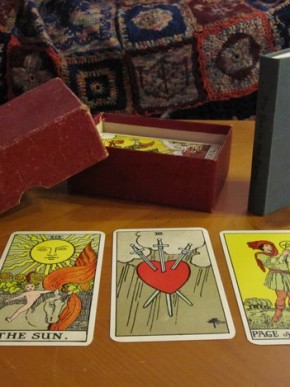
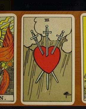
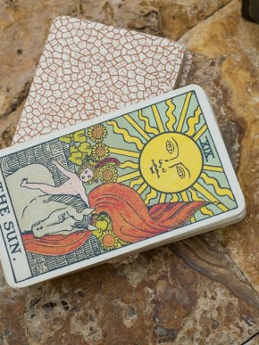
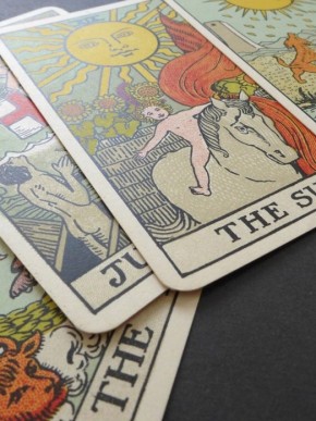
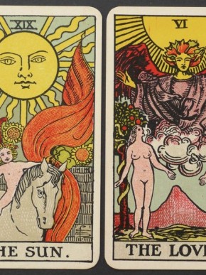
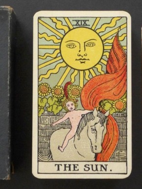
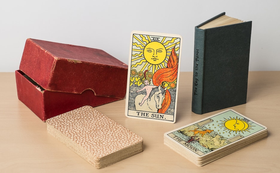
Next we have the battle of the “B decks” (this version) and the “C decks.” This creates an interesting conundrum as the main difference lies in The Sun card. This is the primary factor in determining which deck you have. On this card the “C deck” has an artificially inserted “oh shit!” line (thank you Holly!) obviously not drawn by Pam, who was certainly alive and well at the time, and could have conceivably drawn a new one. This line is missing completely from the “B deck” (again, this version). To make matters even worse, there is the matter of the changes made to the flag and the seedless sunflower (and really—where’s the fun in a seedless sunflower?)
All of these extra bits are missing from this version of The Sun card for some reason. This means that both of these versions of the deck were printed in large runs at different times, but from the same stones. Spectoscopic analysis* of the cards revealed that the art is exactly the same, except for the addition of these three changes in The Sun card. This makes no sense at all of course. Was Rider Inc. in a rush to get these out for Christmas? I can see it now . . . “Hey Charlie! Look mate, we need those cards right now. I know you are still finishing the stones, but how’s about you run of a few so we can get these sold and make our customers happy? You can always go back and finish up after the new year.”
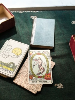
Some of our best researchers adamantly argue that the “C deck” must have come first because the “C decks” come with a Key to the Tarot with a cloth cover and a debossed spine (uninked), and one came with a Key from 1920. In contrast, the “B decks” came with two versions of the Key, both of them with (undebossed) black text on the spine of a paper-wrapped hardcover book (grayish blue); some un-dated, and others dated 1931. This logic makes sense, but as I happen to be the one at the keyboard and I personally believe this is genuine “grade A” rubbish, I say that the lines on The Sun card were not “erased,” but instead added, because someone said “Hey Charlie! Look mate! You forgot the sunflower seeds!”
And seriously: who doesn’t like sunflower seeds?
And so the arguments will continue as we progress with our research. Either way, these decks are remarkably similar; so much so that if your deck came without a Sun card, or a Key, you would be right screwed, now wouldn’t you? In any case, both versions were almost certainly printed by the same card company, even though the KtTs that accompanied this version was printed by Fisher, Knight & Co, Ltd., Gainsborough Press, St. Albans, while the one “C deck” KtT that we know of was printed by Chance and Bland Ltd, Gloucester. Surely this Scooby Doo mystery won’t be solved any time soon.
(* Just kidding: we used Photoshop—see the video here!)
Publisher: Rider & Co
Pub dates: 1931–1939 (suspected)
Designer: Arthur Edward Waite
Artist: Pamela Coleman Smith
Stats:
Size: 70 x 120 mm
Thickness: 25–27 mm
Weight: 206–225 grams
Cost: five shillings
Came with: Slipcase
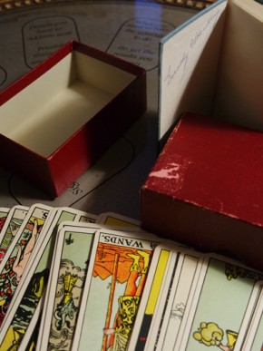
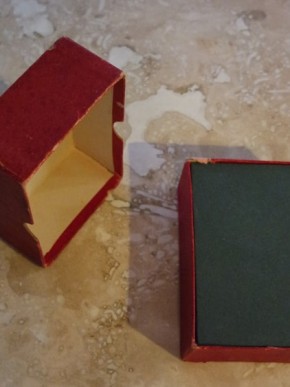
Optional hardback ktT and maroon or red box
Printed in London
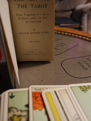
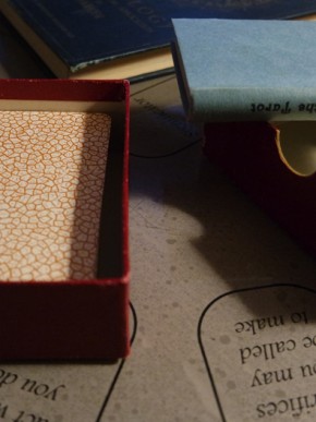
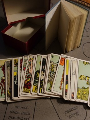
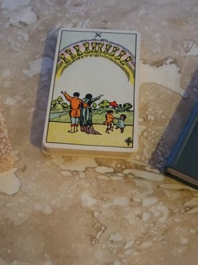
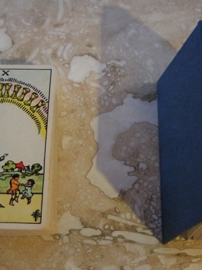
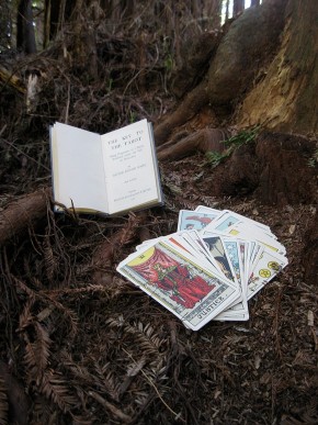
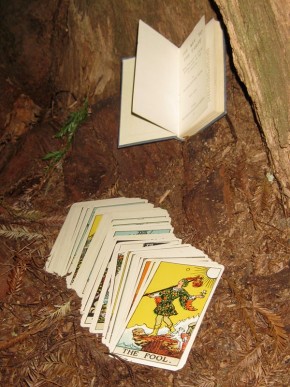
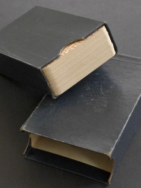
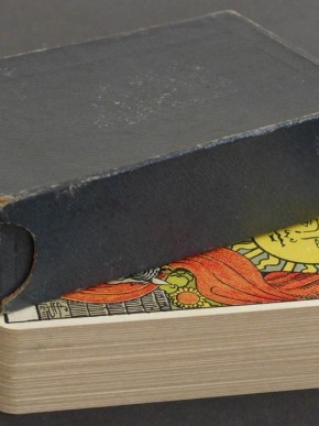
Associated KtT looks to be printed by Fisher, Knight & Co., Ltd. (shown in featured image). Of all of the Keys the ones by F, K & C. were the most disappointing. The lack of ink adherence to their typefaces makes reading the book annoying, and the covers were paper instead of cloth. Also, with the exception of two known decks (“C decks” specifically) these were not blind-stamped but printed on the spines.
Please click on the image to see it full-sized, or on the arrows to scroll through the various pictures.
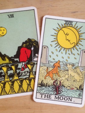
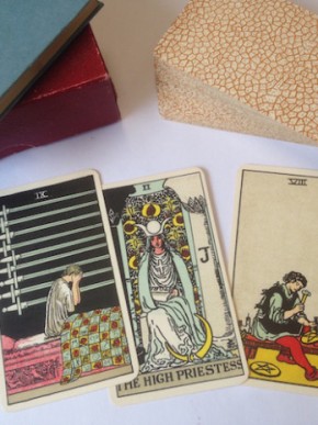
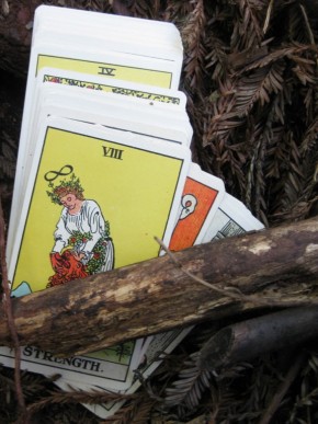
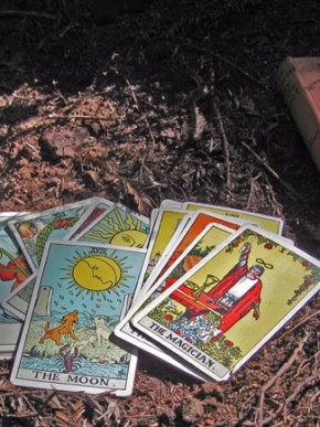
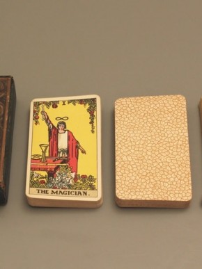
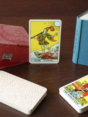
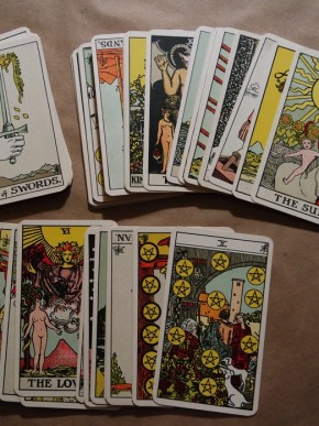
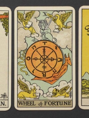
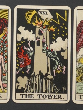
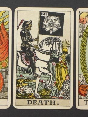
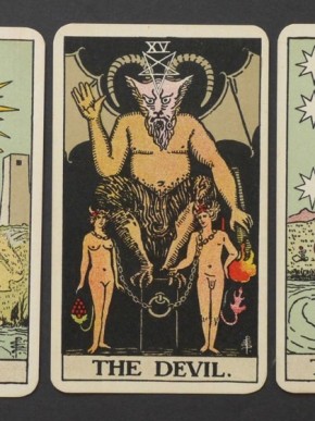
This is a collection of “B decks” from around the world. We will add more images as more collectors submit photos of their decks. At first glance, these images appear to be more clear, bright, and sharp than the originals (“R&L” and “A” decks), but upon closer examination they show the new style of printing “blobs per inch” that make people look like they have the measles. These cards (“B,” “C,” and “D” versions) are an interesting mix of the blobs per inch style of applying color with a solid wash, or blanket of color (like the yellow in The Sun card).
Check out our collection of web-friendly scanned images of this deck here. If you need high-resolution scans of this deck for research purposes, or for your university, county, or national museum, please contact us!
