Rider “C deck” (estimated 1931 through 1939)
This deck is a bit of an enigma, and it causes more disagreements among researchers around the world than the “D deck” to follow. Known decks are reported to have come with Keys to the Tarot (KtTs) that date from 1910 to the 1930’s, making it’s initial publishing date an elusive target. In my humble opinion, this deck appears to be a correction of the “B deck,” to make it more like the original 1909 and 1910 decks, but it is thought by my friend and dedicated researcher that this version came before the “B,” because of the various Keys collectors have reported receiving with their decks (bought used from various sources). Yet another highly respected researcher has thought that this deck was printed before the “A deck.” All of this “fact-based guessing” is enough to make one crazy.
These are not just wild theories we toss around at cocktail parties. The factual information on these cards is so scant that the best estimations we can make are based on fragments of intel gathered over the course of several years from all over the world. We may never find out which deck came first (“B” or “C”), but it is a fun quest to scour musty old libraries and the secret collections of members of various Illuminatis for clues. Here is some food for thought to help you decide when this deck was published (while the rest of us are arguing over minutiae):
The “A” and “D” decks are similar (as discussed on the “D deck” page). The “B” and “C” decks are almost identical. If you missed the master deck comparison page you can find it here. We look at all kinds of decks in broad or minute detail, depending on your whim at the moment and how much time you have to waste. For this page however we can consider that the “B” and “C” decks are nigh-identical; but given that the Keys found with each book were printed by four different printers over the span of two or more decades we can surmise that these decks were printed by the same playing card printer from the same plates, and probably within the same decade. I can say this with a high degree of certainty, as we find that with William Rider & Son, Ltd., and with Rider & Co later, they liked to change things a lot—and often. Even a casual glance at The Pictorial Keys to the Tarot (PKtTs) shows that same orange book was changed continually every few years, even though officially there were ever only two Rider editions prior to 1972.
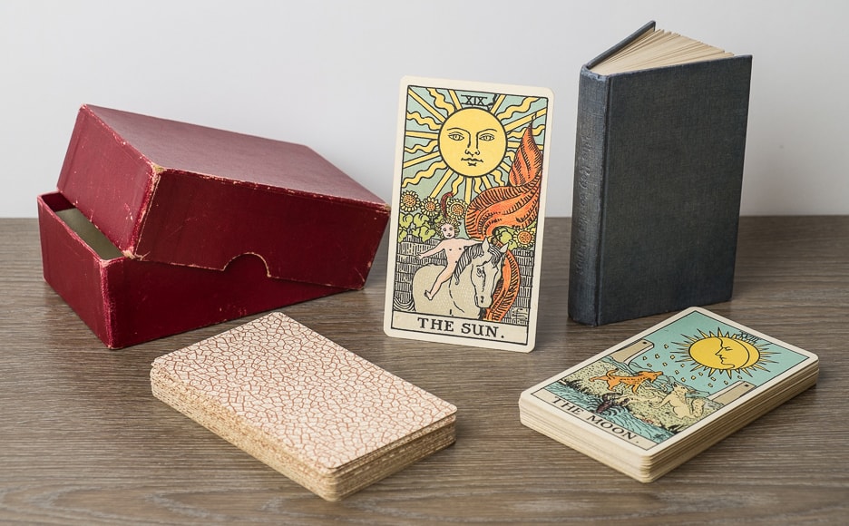
Also, unlike the “Roses and Lilies” or the “D decks” (to come) these two editions (the “B” and “C” decks) were created by serious card manufacturing professionals. They are thinner than any of the other versions and made of high quality card stock that has lasted almost 100 years, with some decks in near-mint condition. We have measured dozens of decks to verify this, and I will happily update our findings if they change. The boxes these came in were always a maroon box (with the KtT) or a very dark bluish green slipcase (that fit the deck perfectly). Again, this is the work of professionals. The quality of the Keys however varies wildly, from expert work worthy of insertion into any heraldic library to cheap penny press work pulled off by someone with access to a printing press and a dull pair of scissors. Despite the variation in print quality however, the binding of the Keys was always satisfactory.
So, what can we guess? Only that these two decks certainly belonged to the 1930’s, with the strong possibility that some were printed earlier. It is doubtful that either of these two decks were the final incarnation unless we move the “D deck” to 1920 (short run) and these as replacements. To understand why we have so many variations of the same art please click here.
In the meantime, here are some more words (some of which you may find amusing). The thing that makes the “B,” “C,” and “D” decks different from the “A” and “Roses and Lilies” decks is the style of printing. Rider went from the crosshatch style of color blending to the “new and improved”(?) ink blobs per inch method (a precursor to the modern “dots per inch” printing method that makes the world go ’round). But this presents yet another problem. As we can see here “dots per inch” printing technology in 1911 was certainly as good as it is today. The printing magazine for printers hiding behind the link in the previous sentence is filled with absolutely stunning work; but then it would be: it’s a printing magazine for printers, showing off the best printing machines and techniques in the world (at that time). So . . .
WHY ARE THE CARDS PRINTED SO CRAPPY?
Arrgh!
I think I will need a toupée to hide all of the hair I have been pulling in stress from this insanity. Look, I like Pam and Art (but not so much Mathers) as much as just about anyone else, but Rider could have hired a much better printer to do the job. Even Pam complained about the printing! Pure speculation says that the cards were produced on a tight budget to make a deck of cards that were cheap enough for everyday use by the common people in many countries. The playing card stock, books, and boxes were all well manufactured, but the quality of the book and deck printing (and cutting in the “D decks”) varied wildly over the years. This may have been due to the effect of the two world wars, as London was dragged into both of those through no fault of her own. What started out as an art piece ended up a low cost commodity throughout the 1930’s, eventually dropping from Rider’s catalog in 1940, only to be reprinted continually in the United States, first by de Laurence and then by University Books, Inc. in 1959 and almost until present day, Tarot Productions in 1968, and even later by a host of other companies. These Rider decks however were only produced for a short time December 1909 through 1939), and only in London, but in that time they found their way to Russia in 1913 and across the ocean to Japan by 1930. In the three short decades of their publication run, these decks changed history forever.
Publisher: William Rider & Son, Ltd.
Pub dates: 1920–1931 (suspected)
Designer: Arthur Edward Waite
Artist: Pamela Coleman Smith
Stats:
Size: 70 x 120 mm
Thickness: 25–26 mm
Weight: 228 grams
Cost: five shillings
Came with: Slipcase
Optional cloth KtT & maroon box
(+two shillings)
Printed in London
Associated KtT looks to be printed by Chance & Bland, Ltd., Gloucester (shown in featured image). We have recently discovered a new version of the KtT that came with a few “C decks.” Made by Fisher, Knight & Co., Ltd. these have blind-stamped (un-inked embossed titles on the) spines and came with two known “C decks.” You can see them here.


Please click on the image to see it full-sized, or on the arrows to scroll through the various pictures.
Here we have a selection of “C decks” from around the world. These decks came in either a slipcase or a maroon “top lift” box that held the book and the deck. Some of the slipcases held only the deck, and the cards fit with Egyptian pyramid builder preciseness, while other slipcases were large enough to it the deck and a Key to the Tarot, most likely printed by Chance & Bland, Ltd. of Gloucester. We are still investigating as to whether the decks and books were printed by the same companies, but it is doubtful, given how many different book printers Rider & Co. sourced.
Rather than strain your eyes, come see our web-friendly scanned images of this deck here. If you need high-resolution scans of this deck for research purposes, or for your university, county, or national museum, please contact us!