University Books decks
These decks are second in importance only to the original Rider decks (1910 through 1939) created by Art and Pam, and started a second “modern” tarot revolution in the 1960’s that continues to this day. No other deck created post-1909 has had much direct influence, and no other tarot deck likely will. University Books has slipped unnoticed for the most part into the musty filing cabinets of history, but their decks continue to influence modern designers and their version of The Pictorial Key to the Tarot is still sold, just as Waite’s version is published by several entities all over the world. University Books has entered the realm of Schrödinger’s cat, being long dead but still pervasive and alive through its continued existence as part of Lyle Stuart and its most famous products manufactured and sold in the 21st century.
Please note:
University Books, Inc.—and only University Books, Inc. gave credit
to Pamela Colman Smith for her design work on the tarot. They did this
in 1960, which means they single-handedly saved Pam from
being written out of history over 30 years before any other tarot publisher
finally recognized Pam in any way. This visionary company made history.
We could use more enlightened merchants like them in the tarot community.
In 1960 University Books, Inc. delivered us from evil (if “evil” can be said to be the lack of full color Waite-Smith [variant] tarot cards that had not been in print since 1939). Sure L.W. had facilitated the sale of tarot to Americans long before Rider ever made a serious go of it (and did they ever, really?) in 1916; and he alone kept the torch burning through two World Wars. A lot of thanks he got for his efforts: he was vilified (I am certainly not arguing the point) and shunned by many, even as his decks and books sold like hotcakes (and who invented that term anyway) for decades in America, and all over the world. But his decks were sooo monochromatic. These new shiny decks were “fab” man! They exploded in trippy colors even as Timothy Leary first dropped acid and the Beatles kicked out what’s his name for being “too cute.” This deck (in its first few printings) arrived just in time for the flower power generation and the rise of the “New Age” in pop-culture. By the time this deck came out University Books, Inc. (or “UB”) had a solid catalog of books worth reading. This deck, in its many incarnations proved to outlive everything else they did and took them “off of the map” and placed them squarely in the history of the modern tarot as the second most important company—ever.
This deck “arrived on the scene (man)” when the company was moving from their swanky digs in beatsville USA (midtown Manhattan; one block from Empire State and Madison Square Garden—I mean this place was groovy) to a sedate little hamlet called “New Hyde Park” (Lon Gyland). After the first printing the company changed boxes, but not physical locations, and printed up a storm over the next several years before finally ending up in New Jersey (more on that here). During its short run this deck proved to be an existential threat to de Laurence’s tarot empire and the inspiration for Frankie Albano, Stuart Kaplan, and even Rider (of London) to all get in the tarot game. This was the shot felt around the world, and it was America’s second official response to London’s 1910 tarot revolution. Below are all of the variations of this deck. Because there are so many, I have showcased only the University Books, Inc.’s editions in the tabs below, while providing links to the other variations below that. Please check them all out, as the story they tell is fascinating and still being written.


 damaged by humidity")
Initially, University Books, Inc. kept with the slipcase offered by Rider & Co. during the 1920’s and 1930’s. This deck came in a two-piece maroon slipcase stamped with the New Hyde Park address in gold (on the side) and a Fool card glued to the front and a High Priestess card glued to the back. This shows a dedication to preservation of lineage and respect to history.
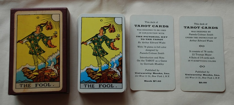
How did they do this for five bucks?
In innumerable ways, the geniuses at University Books were trend-setting visionaries who ushered in the Renaissance of the tarot in America. This version of the deck came with no instructions, but it did come with three “catalog cards” and an advertisement for University Books, Inc’s version of The Pictorial Key to the Tarot. This first edition was released in early 1960 (most likely January or February. There is a common misconception that this deck was published in 1959 because of the Geraldine Moakley essay (copyright 1959) used as a introduction to UB’s PKtT (1960).


This is an image of three “tuck boxes” that University Books used after their initial print run. This (box on left) appears to be the second edition of the original University Books, Inc. deck. The cards themselves were the same, and almost certainly from the same print run, given how expensive it is to set up, print, cut, sort, and box short runs of playing cards. The quality of the printing remains high, but the box, now cardboard (“tuck box”) is unique in the tarot world as it is printed on the inside as well as the out. This only happened once and all evidence points to it being the first “post slipcase” edition of their tarot cards. This had to be done in-house at their small print shop in New Hyde Park, as the additional expense of having an outside print shop run double-sided color printing on the box would have made the $5 price tag impossible. I suspect this to be a 1960 edition as the deck was wildly popular and UB had run out of the cool (but expensive) slipcase boxes they bought in Manhattan. Only their first print run of cardboard boxes would include this luxury of interior color printing. All reprints would be “blank inside.”
There are a few things that make these first boxes essential to tarot history. First, these are the very first tarot boxes in history to have an image of a tarot card on the front cover. Sure, L.W. invented the “tuck box” for tarot cards (actually playing cards had been sold that way for years), but University Books, Inc. created the “yellow box” that is now all but synonymous with “Rider” variant decks. It came from here folks, and they did not get a dime in copyright royalties for their efforts (just like Pam).
As we will see in the next tab (1961 onward), the Sun card graced the cover of each box in a “branding genius” kind of way that told the potential buyer exactly what they were getting while making the packaging artistic, informative, and presentable. Seriously, advertising students could use University Books, Inc. as a case study in marketing genius that continues to work, as other companies swipe these ideas for their own products even 50 years later. Also, we will see that these decks (in the yellow boxes) were the first to include a L.W.B., and how that L.W.B. was pirated by other tarot card companies. Finally, University Books cemented the “standard dimensions” for all modern tarot decks in size and thickness. Once again de Laurence beat them to the punch by 53 years, but as his creation was an outlier, to U.B. go the spoils.


I am calling this the “third edition” of the UB decks. The cards remain the same but the box is now “blank inside” and will be this way from here on. Also, there is the matter of that four-digit zip-code mishap (discussed below). In these images we finally get to see the front of the box, and “oh look, there is The Fool.” That’s odd. Companies that came much later used this very idea, some for their corporate logo. God bless American “ingenuity.” In any case, this is the original yellow box (second edition with no printing inside) that set the standard of “yellow boxes for tarot cards” still used to this day.
If you scroll through the images on the left, you can see the original L.W.B. University Books, Inc. invented this and it is just another testament to their visionary genius. By the way, can you spot the typo that proves that this book was blatantly photocopied by other unnamed major tarot companies? (HINT: It is on page 7)
None of this matters any more of course since University Books is gone and people got away with intellectual property murder along the way, but we can also see the brilliance of packaging University Books, Inc. created, and how their ideas are still being used to this day by practically every other tarot card manufacturer. This is why University Books, Inc. belongs in the history books. Not only did they restart the tarot revolution, but their ideas are still being used to sell tarot decks all over the world.
As great as their innovations were, the printing of cards from the New Hyde Park address (and later locations) is of varying quality. In our comparison section (I will add a link here someday soon) you can see the exact same cards printed in different colors. If you examine decks from different print runs you will also notice the registration gets worse as the colors overlap: the printing gets sloppier and sloppier. This is accompanied by the advertisement cards being printed in black instead of pink and black, when they changed from being University Books, Inc. and became Citadel Press. In some decks the new company name was printed on the advertisement card while the old company name was printed on the box, even though they both had the same address. It seems as if University Books started out as Camelot and over the 1960’s declined into a shadow of itself.
An interesting twist to the puzzle that is University Books’ tarot production timeline involves a number of boxes with a four-digit zip-code. The advent of the zip-code happened during the production runs of University Books Inc.’s tarot decks. The first print run of cards happened in New York City and bore the postal zone code of “1,” but those decks were boxed up and sold with an address in New Hyde Park with no zip code. In the same boxes (possibly just weeks or months later) advertisement cards revealed the new headquarters in New Hyde Park with a five digit zip code. The post office tells me that at least in Long Island there never was a four digit zip code, so I want to chalk these four numerals to a typo since the zip code was in fact 11041 (not 1104). Due to the fact that there are vastly more of these boxes available than the edition I have branded as being the “1960” (second edition) deck (by a magnitude of 20 or more) I can’t help but believe that this was their longest print run of boxes. While the quality of the printing, and the colors themselves, varied, this particular box remained the same until they moved to Secaucus, New Jersey (probably because it had a five-digit zip code).


The deck put out by Carol Press appears in large part to maintain the quality and structure of the “third edition” University Books decks (circa 1961 and onward). The box and cards measure the same, with slight variations in thickness, which may be explained by their age and card condition. Carol Press never put their address on the box, but they did put it on the advertisement card. Presumably they were “going to” print up a PKtT, but at some point shortly after UB was sold or became Carol Publishing Group, Carol Publishing Group became or was sold to Citadel Press (see next tab). The only contribution Carol Press made to the history of this essential deck, other than as a transitory steward was to remove the pink from the advertisement cards and print them in black ink only and jacking up the price of the PKtT.
Artistic value be damned! Save a penny, make a penny!
And that is the legacy Carol Publishing will be remembered for throughout time.


Citadel Press is a division of Lyle Stuart, which seems to be a division of Kensington Publishing. But I have pictures of a Carol Press deck with a Kensington sticker on it. So . . . if the current thought is that UB became CP, did CP become CP or did CP become CP? And where does LS fit into all of this? Well, there is only one way to answer this. I called KP!
The lady who answered the phone was pleasant enough and asked me to email her highly detailed information that she could forward to the appropriate VP in some UNK department, but I have heard nothing back, so this deck is pretty much UB DOA in ’76. Nonetheless here are two shots of a deck we have here in the collection to prove that CP did make a UB deck with UBs old name on the box but CP’s name on the ad card, even though both were listed at the same address in NJ at the time.
WTF? Right?
All of the early versions of the University Books decks are pretty much the same, and may in fact come from one massive print run. Deck printing is done in the thousands to lower the cost (especially when you are only charging $5 and including free shipping!), where box printing can be done in the hundreds or thousands. The first run of decks came with the maroon slipcase above. It is difficult, but not impossible, to hazard a guess at the general number of these that went out. Given the gold stamp printing on the sides, which listed the New Hyde Park address, but included advertisement cards with the old NYC address, I want to say that there were probably around 500 of maroon boxes printed. This is officially a SWAG, but it is based on many factors you can call me up and discuss if you absolutely have to know. It would make no sense at all to print 500 tarot decks (I can speak from personal experience on this), but 1,000 or more would cut the price per deck by 70% or more. This would leave extra decks ready to be sorted, boxed, and shipped. If my crazy theory is remotely correct, this makes the second printing of the box (the “pink insides” version) a simple matter. The decks are paid for and ready to go, and for the cost of the box you can get out a nice product at a market-friendly price.
Remember that these were the first color decks America had ever seen. Sure L.W. was making monochromatic decks in Trix cereal colors, but no one in America had ever seen the old Rider decks. This was a grand-slam of packaging and product, but the market wan’t quite ready for an onslaught of expensive tarot cards. De Laurence had been selling cards cheap for so long that the price point was set and asking for more was asking for trouble. This meant a cheaper box was mandatory, and saving fifty cents or more per deck made an appealing argument for switching from the collectors “first run” to something more “mass market.”
At some point (we are still researching to find the exact date) a company called Merrimack Publishing (on Fifth Ave. in NYC) began publishing a deck with University Books, Inc’s images. This was in the original University Books neighborhood, which makes this an interesting “coincidence.” What is even more of a coincidence (that these decks were being printed and/or sold concurrent with the Carol Publishing deck edition) was that two companies would have the same photo-ready art or printing plates. You can read more about Merrimack and B. Shackman here.
The primary differences between University books, Inc editions and Merrimack/B. Shackman decks were the size of the cards, the backs, and interpretive “key” words to help the reader understand what they were supposed to be getting as a meaning from the images. These decks sold quite well, so much so that the company became B. Shackman (at the same address) before moving to Battle Creek, Michigan (home of Tony the Tiger and Frosted Flakes). B. Shackman was selling these decks as late as 2011, but their current website does not list any tarot products.
In any case, University Books is the only company to leave a bona fide tarot legacy other than William Rider & Son, Ltd. University books of 1909 through 1939 fame. University Books brought the tarot to America in full color, they invented the L.W.B. (which some of the largest tarot publishers in the world directly copied), they invented the “Fool on the front cover of the box” (which “some” of the major tarot card publishers copied—in fact their tuck box design set the standard for every modern tarot deck manufacturer in the world and is still being used to this day), and they invented the world’s tiniest deck (which . . . oh hell, you know where this is going). University Books, Inc. did not invent the tarot, but like any great American empire; they took a viable idea and perfected it, and then mass marketed the hell out of it. One can only hope that Kensington Publishing is a faithful steward to this legacy of American innovation in the tarot.
Below are scans of the various U.B. editions—Merrimack ones are here