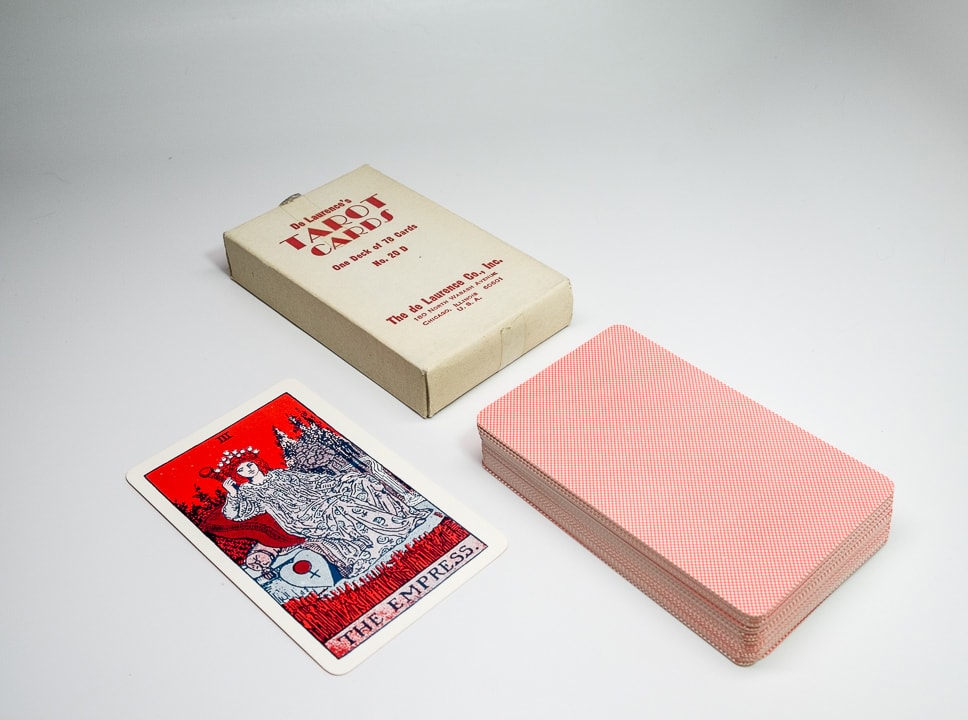
de Laurence’s “red” tarot deck
This was the last tarot deck produced by the de Laurence company. We know that it was introduced in 1962 or early 1963 because of records involving the de Laurence Company’s address changes at the time, and the introduction of the five digit zip code in July of 1963. Of the four main editions of de Laurence’s decks these are the least attractive, and usually the least valuable (asking prices on eBay by amateur sellers and deck scalpers not withstanding). It’s a simple matter of print quality. The first runs of L.W.’s “square yellow” deck and his KtT were extremely well crafted, considering the lack of actual color. Later editions of his KtT (which was really a PKtT that he dropped the word “Pictorial” from on the cover, and changed the title to “Illustrated” on the title page) had a harsher yellow and then simply grayscale images. Velo’s “round yellow” decks were arguably the finest decks the de Laurence company ever made. The “orange” decks were extremely well crafted as well (in the beginning). By the time Velo (or his successor; but most likely Velo) made the red decks, University Books, Inc. had destroyed the market by unleashing some of the best tarot decks created at that point in history. The world could now get a deck for five bucks that were printed in a true four-color process (in contrast to L.W.’s infamous “five oriental colors”).
The people at University Books, Inc. took their occult studies seriously, and it showed in their catalog (small by de Laurence standards) and their first run of tarot cards. The “de Laurence red” decks by comparison were a mail-order special. The old ads (from 1918) still ran in the annual catalog, as Velo knew better than to waste money “fixing” a winning formula, and the ads were occasionally updated. The original claim of the cards as being printed in “five oriental colors” was changed to them being comprised of “occult colors”* and the claim that the KtT was printed on the finest paper had been dropped. Velo subtly altered the ad copy in the catalog, hinting at when the decks and books changed versions.
* I suppose “red” is an occult color, as is black, but also blue, yellow, green, brown, and even indigo. Come to think of it there are many “occult colors.”
Publisher: de Laurence, Scott & co.
Pub dates: circa 1962–1963 and beyond
Designer: Arthur Edward Waite,
L.W. de Laurence, Velo de Laurence
Artist: Pamela Coleman Smith
Colors by: Velo de Laurence
Stats:
Size: 121.5 x 74.5-75.5 mm
Thickness: 20.5 mm
Weight: 202 grams
Cost: $3.50
Came with: White box and L.W.’s IKtT


Please click on the image to see it full-sized, or on the arrows to scroll through the various pictures.
For your convenience, we have included comparison photos of the various decks here in addition to a few solo shots of the “red” deck, so you can see the differences between decks. Sellers often mistake a red deck for an orange, or an orange deck for a red. As they both share the 180 North Wabash address it can be easy to be confused. Always ask for images and look carefully to tell which version you are getting before you buy. The red decks were the last printed by the de Laurence Company.
Click here to see our web-friendly scanned images of this deck here. If you need high-resolution scans of this deck for research purposes, or for your university, county, or national museum, please contact us!