Rider “A deck” (1910 through 1920)
In March of 1910 William Rider & Son, Ltd. of London fired the shot heard around the world by officially publishing the first English tarot deck, and in so doing thumbing their nose at the generations of French and Italian traditional tarot decks, starting a revolution that gave rise to the modern tarot. This new deck had detailed scenes on all of the cards, not just the trumps and Fool. This was not the first to do so, as we can see in the Sola Busca deck. In fact, several of the images were blatantly lifted directly from the SB deck, as well as other sources. But this new deck captured the imaginations of the public because it had quaint faux Medieval scenes of common people running around doing common things, all comfortably supervised by oligarchs of their various tribes, and that was overseen by a mishmash pantheon of Pagan deities and Christian icons. To a deeply religious modern feudalistic society this was an instant hit: it had all of the comforts of known reality and enough fantasy to spark the imagination.
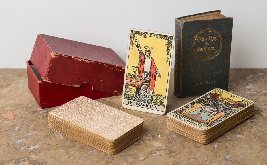
The progenitor to this deck (the 1909 edition currently referred to the “Roses & Lilies” deck) appeared on December 10th, just 3 months before, and a limited number of prototype decks were made to be shown at a local art fair. Sadly, they were of inferior quality, and like many automobiles of today, were recalled. This deck was the “new and improved” version of Waite’s ambition to create a tarot deck for the unenlightened public (those not hip to his secret cabal of initiates). The main differences between this and the 1909 version were a higher quality playing card stock (versus the art paper used in the prototype deck) that came with a back that looked like “cracked mud,” better printing, and damage from the printing machinery (probably a misaligned wheel) that gouged the wet ink, creating white vertical streaks on several cards. This damage is unique to the “A” version of the Rider decks and its presence assures you the finest quality of British manufacture. Accept no substitutes.
This deck initially sold for five shillings net (postage was fourpence) and came with or without a “Key to the Tarot” for an extra two schillings sixpence. By November the price had raised to six shillings (but with free shipping! Please note that this was 95 years before Amazon Prime). You also had the option of the much larger “Pictorial Key to the Tarot“ (now with pictures!) for an extra five shillings.
In November 1915 there was a price drop from 6 shillings (June 1915 pricing) back down to the original 5 shillings price of 1909. This makes us think (a speculative endeavor) that it was at this time (November 1915) the “second impression” was printed. That and the fact that “A” decks that came with a Key to the Tarot dated 1920 were made of thinner card stock and had a red dot missing from the Magician card. The only problem with this theory is that there should be 1915–1919 “Version two A decks” with 1910 versions of The Key to the Tarot, but damned if we can find any to prove our wacky theories.
Other than the card back and the vertical damage lines, there are a few easy ways to tell that you possess the genuine article (an “A” deck, regardless of when it was printed): The printing style of the time employed a crosshatch method of shading (click here for giant version of that image) that we see only in the “R&L” and “A” decks. The “B,” “C,” and “D” decks (all printed later—and probably at a different print shop) use tiny ink blobs for shading. None of this is to infer that British printing of the day was of an inferior quality. These cards were done on the cheap because they were made to be used by everyone.
By far the easiest way of knowing what deck you have is to look at the Sun card. On the “A” decks (no matter when they were printed) there is an extra “squiggly” line at the top of the sun, to the right of the card number (19 by the way—this will be important later, and there will be a test). Holly Voley calls this the “oh shit!” line, and I could not agree more. Here you are going around the perfectly drawn circle of the sun, making wavy lines for heat and straight lines for light: wavy, straight; wavy, straight; wavy—“Oh shit!” you just carved an extra squiggly line into the lithographic stone. Hopefully no one will notice, right? This line was erased in the later “B” version of the deck, and then reinstated (albeit poorly) in the “C” version; or it was recreated (poorly) in the “C” deck and then magically erased in the “B” deck a few years later (we will learn more about this on those pages). Being that the “D” version was a cheap photocopy of the 1909 art it really had no say in the matter. At this point no one knows whether it was Pam or the original copyist who made the mistake, but given that the Occult Review article of December 1909 had a review of the new deck, with larger than life images, had the Sun card with the “O.S.! line” and as a bonus the number XVIII (18 to any non-Romans reading this) instead of XIX (19) it casts suspicion on our favorite female tarot artist of the early 20th century. It was a rush job, and one for very little pay, after all.
Publisher: William Rider & Son, Ltd.
Pub dates: 1910-1920 (suspected)
Designer: Arthur Edward Waite
Artist: Pamela Coleman Smith
1910 stats:
Size: 70 x 120 mm
Thickness: 38-41mm
Weight: 260 grams
Cost: six shillings
Came with: Slipcase
Optional KtT and maroon box
Optional PktT in Nov. 1910 & slipcase
1920 stats:
Size: 70 x 120 mm
Thickness: 34-35mm
Weight: 252-260 grams
Cost: five shillings
Came with: Slipcase
Optional KtT and maroon box
Optional PktT and slipcase
Printed in London
Associated KtT was printed by William Rider & Sons, Ltd. It is shown in featured image and can also be seen here. This is the best representation of Art’s vision of this book.


Please click on the image to see it full-sized, or on the arrows to scroll through the various pictures.
This is a collection of “A decks” from around the world, published from March of 1910 through 1920. The “second edition A decks” were a bit thinner (please see deck stats) and came with the 1920 “New Edition” of the Key to the Tarot. The art did not change in the second version but we suspect the red plates did as the lack of ink on The Magician. (NOTE: make that a link to Saskia’s comparison image) In some of the images are the Keys that came with these specific decks.
Also please note that this is the last time the “cross hatch” style of inking (color) was used. In all later editions the printers moved to a newer technology that printed “blobs per inch” of color to produce various sub-tones from basic four color printing. This is one of our strongest clues for when the old decks were printed, and by whom.
Here are web-friendly scanned images of this deck. If you need high-resolution scans of this deck for research purposes, or for your university, county, or national museum, please contact us!