The Key to the Tarot - House of White Tarot Museum & Research Library
This was Waite's first attempt at a public instruction book on how to read tarot cards. It would later be replaced by "The Pictorial Key to the Tarot" (now with pictures!) in 1911 and 1922.
A.E.Waite, tarot, key, book, Rider, divination, how to read cards
21089
page-template-default,page,page-id-21089,ajax_fade,page_not_loaded,,select-theme-ver-3.0,wpb-js-composer js-comp-ver-4.12.1,vc_responsive

The Key to the Tarot—and later, The Pictorial Key to the Tarot—was, in hindsight, Waite’s magnum opus. It is not without its flaws, but then again, who isn’t, so why should these two books be any different? The important thing here is that Waite chose to release what he considered secret information (with constant hints at what he wasn’t disclosing) after his work on the Tarot of the Bohemians, which was (re)published by Rider at the same time as his Key and deck. The Key to the Tarot is Waite’s direct contribution to tarot literature. He authored many other books, and translated even more, but this is by far his seminal work on the tarot itself. These are his beliefs, his words. The text is dry and boring and stuffy, but it has been read by more people than any other tarot book in history. It has been published by dozens of publishers, from quick buck artists to the major publishers of the world. Most of what the public believes about the tarot comes directly from this book, or from people who cut their teeth reading this book. In many way it is the Think and Grow Rich of the tarot world.


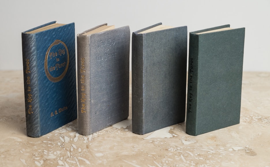
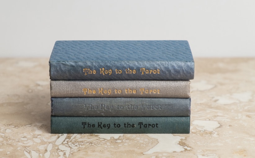
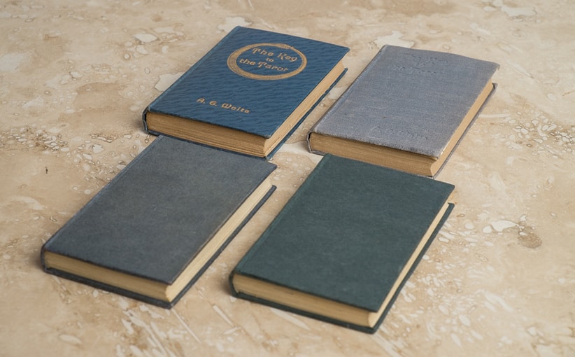
Our focus here is on the Rider editions, from 1909 to 1975, but even more specifically the various print runs that accompanied the Rider (Waite-Smith) decks from 1909–1939. There are officially five versions of the original Waite-Smith deck, but it turns out there are many more versions of the Key to the Tarot (or KtT) that came with them. Below are images, stats, and short descriptions of what we know of them. Please note that The Pictorial Key to the Tarot has its own page, and its own messes to clean up. Click here if you want to see all of the various Keys to the Tarot in one giant table.

1909 Key to the Tarot

The 1909 Key to the Tarot was printed by William Rider & Son, Ltd. Their name appears on the last page (page 194—this is important, and there will be a test later). It does not state that they are the printer, but in the 1911 Pictorial Key to the Tarot we see the same exact layout with the word “printers” inserted into the footnote text. It is possible Butler & Tanner was the uncredited printer of these and the 1910 Keys due to the singularly exceptional quality and similarity to the 1920 KtT, but this is unlikely given Rider’s propensity for always giving credit as a matter of character. Rider used dozens of printers during the early decades of the 20th century, and often simultaneously (for different books and publications).


Both editions (the 1909 and 1910 KtT) have the blue scalloped cover that marks them as first editions, and the date “1910” printed on the title page. The primary difference between this edition and the next, printed just a few (weeks or) months later, is the upgrade from a blind stamp (deboss with no ink) front cover to a gilt deboss (stamped impression with ink—in this case gold). Both versions has the title gilt stamped with the words running up the spine instead of the modern convention of down, and of course the snakey and Waite’s name on the front. So: blue snakey on the front means 1909, gold snakey on the front means 1910.

1910 Key to the Tarot

The 1910 edition of The Key to the Tarot is an exact reprint of the 1909 version, and in fact it may even come from the same print run. This would only make sense given the logistics of printing books. The editing, typesetting, platemaking, cutting, sewing, and binding all involve a tremendous amount of labor and expense. Given that both versions are printed with a 1910 pub date and the only difference is that the few Keys that came with the 1909 Roses & Lilies deck don’t have the front cover debossed in gold, the most plausible theory is that those were rushed out for the arts and crafts fair with the prototype decks while the rest of the books languished until early March. Summation: Most likely it was one print run, and when it came to binding, the gold stamping of the front cover was still in question. If you take a look at various William Rider & Son, Ltd. publications at the time you will see there was an inconsistency of books with gilt-stamped (gold ink deboss) front covers and blind-stamped (debossed with no gold ink) front covers. The name William Rider & Son, Ltd. appears where the name Butler & Tanner appears in the 1920 edition, and where the name William Rider & Son, Ltd. Printers appears in the Pictorial Key to the Tarot one year later, so it looks like this credits them as the printers.

1920 Key to the Tarot

The 1920 edition of the KtT was printed exclusively by Butler & Tanner, a printing house and bindery of epic proportions with a reputation for impeccable quality. The page numbers jumped from 169 (with a bibliography that read like a mail order catalog to bring the page count to 194) to 212 pages. This was accomplished by the use of a tighter font, minute changes in pagination, additional words, and five large diagrams.


This really was a new edition,” as promised. The font needed to be condensed and the paper made thinner (and of  higher quality of pulp) to cram all of these extra words and full page illustrations into the same book measurements. At first glance this edition looks to be the same as the previous two (aside from the cover changes), but Art went back and added to his previous thoughts, necessitating a change in the printing plates. While the cover to this Key reflects a more conservative appearance (no arcane symbols—just the title centered on three lines and shoved to the left side of the cover) the inside of the book was far more verbose, in an attempt to clarify most points for easier understanding. In the back of the book the 21 page bibliography that ate up 25 pages to match the book signature was scrapped to fit in all of the extra instructions. In this way it is a superior edition, but the gold snakey (or “ouroborous”) was gone forever now. This edition appears with both the “A” and “D” versions of the original Rider decks.

1931 Key to the Tarot

The 1931 edition of the KtT is a reprint of the 1920 “New Edition” version. Do to poor record keeping in the past we must now rely on dates that were inserted on the title pages with no guarantee that those dates reflect the printing dates of each KtT. The December 1909 KtTs were dated 1910 (common practice), but so were the 1910 Keys, and all other KtTs printed up until 1920. Then we have to assume that all of the “not new editions” were in fact sold out or destroyed and never ended up with a new deck by accident, sloth, or design. Then, just to really complicate things, Fischer, Knight & Co, Ltd. (Gainsborough Press) printed up (presumably) still later editions with no dates on them at all. These are simply marked as “undated” and we hope for the best.


The 1931 KtTs came with either a “B” or “C” deck, and were printed by Fischer, Knight & Co, Ltd. in Saint Albans. The covers were flat gray paper, or grayish-blue textured cloth. The title was blind stamped on the spine and the front and back covers were blank, which makes sense since they only came in a box with a deck of cards. They were never to be set out on display or left out of the box when not in use, so why spend the extra money on a handsome cover? These Fischer, Knight & Co, Ltd. Keys were the dark ages of KtT production. The work was journeyman at best, and matched the lessening quality of the cards that came with these books.

Undated Key to the Tarot

(Deep breath . . .) Okay . . .


Rider (by this time they were “Rider & Co.”) it seems had gotten sloppy. Of course this edition could well have been during WWII, so that would forgive a lot; just the fact that they were able to continue to put out books and decks speaks volumes. But at this point their business was a shadow of what it had once been.  The quality of the book printing and binding suffered greatly, cheaper materials were used, and the cards themselves were not as wonderful as the first runs. Nonetheless they persisted, publishing for the masses. Keep in mind that at this time Velo de Laurence (“Junior”) was happily pounding out decks and PKtTs in Chicago. The printer of note for this edition was Fisher, Knight, & Co., as was the KtT edition 1931, but the quality of the printing was just horrid. Say what you will about saving ink for the War (if that is what they were doing), but at some point a drop in quality gets to a point where it is just an embarrassment to your customers. And that is where this edition of the KtT comes into play.


It is thought that this is the Key to the Tarot that was printed until 1939, or “sometime after 1931 through 1939 when Rider of 1971 says that they stopped printing tarot decks.” Now, that said, here is a wrinkle. There is a softcover KtT I have seen pictures of but cannot seem to find, in between all of the listings for other softcover KtTs that came later. This would be a paperback KtT with a white cover and bold (dark blue?) print. We (collectively) believe this mystery edition was published in the 1940’s, as it came with a “B” deck and beyond. I will add images and information as we obtain it, here.


Unicorn Bookshop

Please click on the image to read more about Unicorn Bookshop and this version of the KtT.


Just before the grand explosion of tarot books and decks in 1971, 72, 73 . . . a tiny bookshop in Brighton wanted to run off 100 copies of The Key to the Tarot  for their local customers. No one knew that publishers all over the world were clandestinely racing to print decks and books to capitalize on the massive successes University Books and Tarot Productions (Frankie Albano) had gained in the States. Unicorn Bookshop contacted Rider & Co. seeking permission to print 100 books independently. They got it, hand typed up a copy (back in the days when you had to use a typewriter of all things!) and ran off copies on a mimeograph machine famous for its purple ink and funky ink smell. We obtained a pristine copy which is available for inspection and research. Unfortunately Unicorn Books is gone now, but you can read up on them here if you like.

unicorn1-min