Who printed the Key to the Tarot?
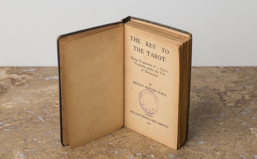
In December of 1909 William Rider & Son, Ltd. (which was owned and operated by “son” at the time) published Waite’s The Key to the Tarot for the first time. This was after Samuel Mather’s 1888 The Tarot and Waite’s various books under his previous nom de plume “The Grand Orient.” Over the years William Rider & Son, Ltd. became Rider & Co., but the book title (and Waite’s new pen name) stayed the same. Four hardbound editions of The Key to the Tarot were published by Rider before 1971 (when a new edition was published), and at least one softcover (circa 1940), and possibly one around 1910, but no such beast has been found as of yet. Below is what we know about who printed what and when, when it comes to the KtT.
This is important because it has been assumed in the tarot research community that the book printer was also the card printer, but we know that was certainly not the case with the 1909 prototype deck. Card printing and book printing/binding are two different specialties, and may be done by one print house, or more often, by print houses that specialize in certain areas. In our quest to figure out who actually printed the tarot cards themselves we naturally must start with who printed the books for Rider. Here are the known printers of the tarot instruction books from 1909 through 1939.
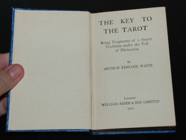
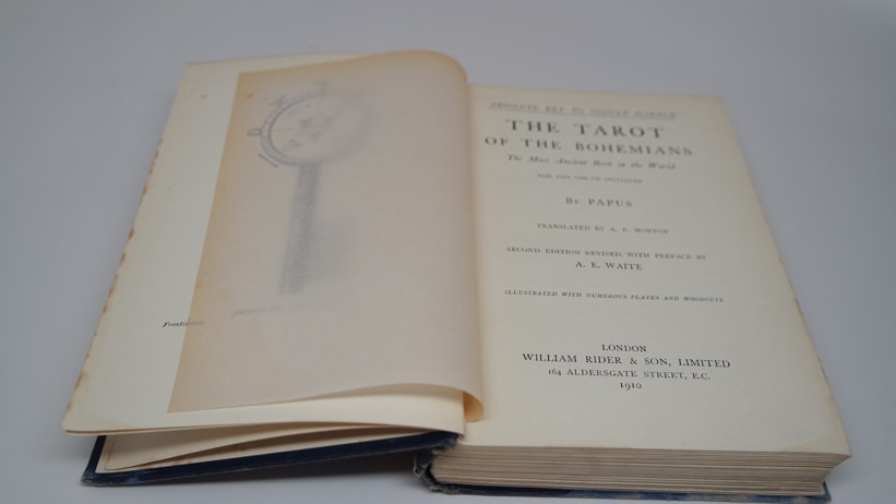
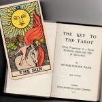
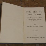
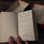
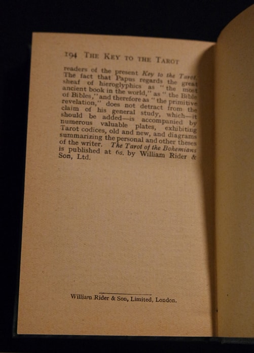
The first incarnation of the KtT was a small blue book with a “blind stamped” front cover (debossed, but no ink) and a “gilt stamped” spine (debossed with gold ink). The printer credited was William Rider & Son, Ltd. The book was 194 pages long and ended with a casually worded advertisement for The Tarot of the Bohemians, (re)published earlier that year by William Rider & Son, Ltd. The TotB (or sometimes just ToB) was written by Papus. It had originally been published (in English for the first time) by George Redway, of London, in 1896. Wm. Rider & Son republished this book, subtitled “Absolute Key to Occult Science” (which is where Waite got the name “The KEY to the Tarot”). Unsurprisingly, Arthur Edward Waite was listed as having written a preface (he also revised this book more to his personal tastes in the process).
The ToB was printed by Ballantyne, Hanson & Co. (Edinburg & London) and is essential to the history of the Waite-Smith deck (and everything that came later) for so many reasons, but most obviously because this book was published before the KtT or any deck(s) by Rider. It came first and without any warning that there would ever be a deck or a “Key to the Tarot,” except for the fact that on the cover is the never-seen-before Wheel of Fortune “designed by Art with line art by Pam” image in all of its glory. This image is unique as it reveals more “picture” than any other WoF image ever recorded. The margins are a bit wider and the clouds are spaced a bit further from the wheel, allowing a slightly more spacious feeling. Also, Pam’s signature is square and blocky. This is the only time anywhere that happens. This book came out in late fall of 1909 and gave us the first hint that there was a tarot project underway; hiding as it were, in plain sight. As much as we do not know exactly whom it was that printed the 1909 KtT, all signs point to an uncredited Ballantyne, Hanson & Co. of Edinburg & London. It is remotely possible William Rider & Son of London completed the task, but given their fondness for working with established book printers and binderies this is a stretch of common sense.
The 1910 version of the KtT is identical to the 1909 version, since they were released only three months apart, and almost certainly printed and bound at the same time. By all appearances it seems the copies ready December 10th were rushed out for the prototype deck: The spine text (title of the book) was stamped in gold, but the front cover (title and snake) were stamped but not in gold. By contrast, the copies ready in March were stamped in gold and had gilt top pages. Both editions have a date of 1910 on the title page, and both end on page 194. Additionally, William Rider & Son, Ltd. was credited on page 194 as the printer.
Given how uneconomical it would have been to hand-assemble the type for each page, and then print, cut, and bind 50 or 100 books and then do the entire process again for another 1,000 a few months later, it is almost certain that the 1909 and 1910 editions were printed and bound at the same time, with the cover stamping occurring at different times (the rushed prototype and the final product after). This is a wild assumption based on nothing in particular, other than attending print shop in high school (yeah, they still had that when I was a kid), designing (and binding) my own books and magazines in my 20’s and 30’s, and a lifetime of experience wasted in cottage industry retail and manufacturing businesses (I should have been a supermodel). I come to these conclusions based on basic business sense, but they are still “SWAGs,” so take that as you will.
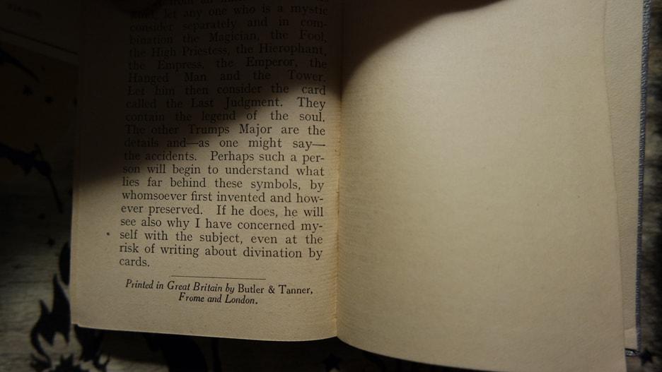
Signs point to Ballantyne, Hanson & Co., as the printers of these (1909/1910) editions but it could just as well be Butler & Tanner. The director of the B&T museum in Fromme sold me a book (on Butler & Tanner) but after much questioning was unable to provide me with any information on whether they ever printed books for Rider. Nonetheless, research continues as long as there are still children of the people who printed these books alive and living in the area.

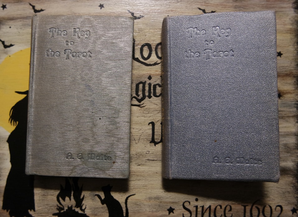
In 1920 Rider & Co. published a new edition of the KtT they ingeniously labeled “new edition”. This edition had 212 pages, ending with an ominous warning of information hidden within a select number of cards that Waite dare not speak of. It really is the oldest magician’s trick in the book, and one employed by con-artists and seminar gurus the world over: “I suppose that I could reveal to you secrets that I am privy to (for free), but in so doing I would break the oath I have sworn to protect these life-changing bits of essential information that I am lording over you” (or) “I could discuss such matters with you if you were a (paying) member of our secret club,” at which point the sales pitch would direct you to the pretty girl accepting “new member’s” applications (applications being in the form of a personal check or credit card). I am not outright calling shenanigans on Waite, but having invested my own lifetime into the study of religion, philosophy, and metaphysics I dislike the way he chose to end his opus. Nonetheless: published with different bindings: sometimes silver, other times blue, and occasionally in a silvery-blue, the 1920 “new edition” of the KtT was proudly and expertly printed by Butler & Tanner, who almost certainly bound them as well. No ouroboros, no gilt edges or stamps, and no Leoine (or is it Leo-esque?) title on the cover. Just a tidy “centered title” shoved up in the top left corner, with a conservative author credit counterbalancing it in the bottom-right. At least the spine text was gilt stamped, so all was not lost to minimalism.
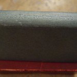
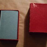
The 1931 publication of the Key to the Tarot came either as a flat gray paper covered hardback or a grayish blue textured cloth covered hardback. Both versions had the title blind stamped on the spine but nothing on the front or rear cover. These Keys came with “B” or “C” decks. If I had to guess (and I do feel the need to after all of this research), this was the result of two separate print runs, both occurring at Fisher, Knight, & Co., Ltd., Gainsborough Press, St. Albans.” Given the trajectory from scalloped blue cloth with a gilt stamped cover and spine text (1910, 1920) to a blue, or silver, blind stamp cover and spine (1920), to this edition (1931), and then the last (below), I would have to say that the blue cloth 1931 edition came before the gray paper (1931) edition. The blue cloth edition came with a “C” deck while the gray paper covered Key came with a “B” deck. The next Key will come with a paper covered hardback, and always with a “B” deck. Sadly, this adds credibility to Saskia’s claim that the “C” came before the “B.” (Looks like I owe her five bucks.)
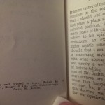
Unlike the Keys from other printers, the work here is shoddy and sloppy and it reflects poorly on the once mighty William Rider & Son, Ltd. The printing alternates between faint and “partially inked.” The quality of the Keys printed by Fisher, Knight, & Co. make the cards look cheap and unprofessional; like a vending machine novelty instead of a tool used for professional divination or spiritual exploration. This matches the drop in quality of the cards themselves, although it would not make any sense that Fisher, Knight, & Co. printed the cards. If they did the ink saturation would be anemic. It looks as if the cards were always printed by the same company (except for the 1909 prototype deck), but with different plates. The Keys however shifted companies with the job probably being awarded to the lowest bidder.
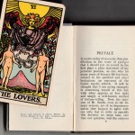
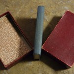
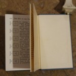
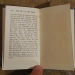
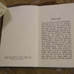
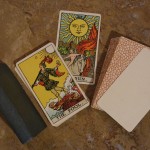
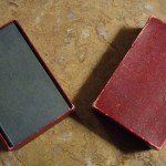
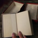
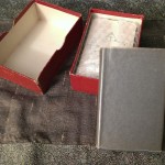
In Nineteen (er . . . something or others, mutter, mumble YEAR!) Rider & Co. released their last hardcover version of the KtT until they reprinted it in 1972 (the hardcover edition). That 70’s version was also the size of a deck of cards, but did not fit in the box itself (they came with a LWB at that point). But back to the 19(something) edition of the KtT, we can see (pictures on the right and also here) that this was the least expensive, and most pedestrian, of all of the Keys ever put out by Rider. It was designed to come inside a red box with a deck of cards (the “B” deck), and sold from (around) 1930-something to 1939. The quality of printing and binding is horrid by standards set (literally the gold standard) in 1910 by William Rider & Son, Ltd.
F, K, et Cie. really boned this. The binding itself is passable, and the book “cloth” (paper) came in either dark gray or dark bluish gray (probably based on the print run), and also the spine text was printed cleanly (though not embossed). But the spine text was the only text printed cleanly in the entire book. The lack of ink saturation on the typeface speaks of cheapness. This may be due to ink shortages in Britain in WWII and afterward, but newspapers were being printed, as well as magazines, money, and contracts, and those all had decent ink saturation; so perhaps the war cannot be blamed for this mess.
These are far and away the most available Keys of the original Rider era. They are not easy to come by, but of the known KtTs in collections, libraries, and museums, this is the one most often seen, which also lends credence to Saskia’s assertion that the “B” deck that accompanied this book was the “last in line.” But who would erase dots on a sunflower, for no reason or gain, on purpose?
After the fact . . .
Following Rider’s introduction of The Key to the Tarot to the world, there were only every a few publications of this book, some with permission, most without. In 1971 Unicorn Bookshop ran off 100 copies, each one a special snowflake in “indie publishing” (see bottom of this page).
Before that, University Books, Inc. published the most famous Pictorial Key to the Tarot ever, one that has spawned countless clones, and set the stage for “full color” tarot books. Their work was pirated or copied with permission by several companies, but no actual credits ever seem to show up in print. At this point Kensington Publishing seems to own the rights to University Books’ works, but they are not returning any phone calls.
Original Pictorial Key to the Tarot printers were credited as:
- 1910/1911: William Rider & Son, Ltd. Printers; gilt with gold cover and spine text, gold ouroborous
- 1920: William Rider & Son, Ltd. Printers; spine text in gold, front cover debossed but inkless
- 1922: Butler & Tanner “Second edition”; gold cover and spine text and black cover and spine text editions
Later publishers of the PKtT are innumerable, but here is a list anyway, just for fun:
- William Rider & Son, Ltd. (1910, 1920*)
- Rider & Co. (1922, 1931, 1939, 1971, 1972 . . .)
- de Laurence & Scott Company (1916: claims copyright 1916, copyright 1918, republished 1920’s through the 1960’s)
- HarperCollins (1986)
- Penguin Random House (RHUK bought Rider & Co.)
- Unicorn Books (1971)
- University Books, Inc. (1960: claims copyright 1959, 1962, 1966, copyright 1987)
- Causeway Books (1973 through 2000 – reprint of University Books, Inc.’s 1959 first edition )
- Samuel Weiser (or) Red Wheel/Weiser (1971 through 2008)
- Rudolph Steiner Publications (1971: claims copyright 1971)
- Harper & Row, Publishers (1980 – “reprint of the 1971 ed. by Steiner Publications”)
- Citadel Press (1979 through 1995, also see University books)
- Waakirchen: Urania-Verlag (1978)
- U.S. Games Systems (1977 . . .)
- Barnes & Noble (1978 . . .)
- Dover Books (2005 – “from the 1911 version”)
- Axiom Publishing (2007)
- Createspace publisher #1 (2008)
- Createspace publisher #2 (2009)
- Createspace publisher #3 (2010)
- Createspace publisher #4 (2013)
- Createspace publisher #5 (2015)
- Paragon (1993)
- Martino Fine Books (2012 – reprint of University Books, Inc.’s 1959 first edition)
- Lyle Stuart (1989 see Citadel Press, also Carol Publishing)
- Multimedia Publishing (1971, 1975)
- C Trade Paper (1989 – possibly Carol Publishing)
- Galahad Books (2000)
- Garber Communications (1986)
- David Westnedge, Ltd. (1996 through 2003)
- Blauvelt (1976)
- Cosimo Classics (2007)
- Dodo Press (2008)
- Kessinger Publishing, LLC (2003)
- Read Books (2013)
- France Press (2013)
- Literary Licensing, LLC (2014)
- Budge Press (2013)
- Forgotten Books (2008)
- Jazzybee Verlag (2013)
- Didactic Press (2013)
- Sun Publishing Co (1981)
- Amazon Digital Services, Inc. (2010)
(* No copyright ever registered)
