The Waite=J.K. Tarot decks
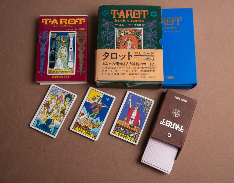
The Waite=J.K. Tarot was published by Tairiku Shobou, of Tokyo Japan, first in 1975 and then much later in 1989. It seems they published quite a bit of manga as well. They went bankrupt sometime between 1999 and 2006, so this is the only connection we have with them to the Waite-Smith decks. The art was done by Seigan Nakajima under the supervision of Alexandria Mokusei-ou. The actual cards measure 4 5⁄8” by 2 2⁄3” and this first edition has backs that are brown with a white Shield of David and what looks to be a highly stylized a yod in the center. This will be replaced in later editions.
So much love was put into the creation and presentation of this first edition that it puts most modern decks to shame. Nothing was left to chance; from the symbolism (albeit inconsistent and incongruent) on the decks, books, and display boxes, to the instruction cards, snap-case protective case, and turn of the century font on the Romanized cover (a nod to the era of the Waite-Smith’s deck creation). This is a small treasure—a common item of exceptional quality crafted by loving hands. Four versions are presented below for your enjoyment.


Please click on the image to see it full-sized, or on the arrows to scroll through the various pictures. Or. . . Check out our collection of web-friendly scanned images of this deck here.
This is what the first edition of the Waite=J.K. Tarot decks looked like. The card backs were bathed in a solid brown ink, with a shield of David on the back which sported a highly stylized yod. I had to ask the creator of the deck to verify that this is, in fact, a yod, and not a zayin, dalet, or khaf. The problem with font calligraphy is that it can be so stylized that letters appear like other letters to the untrained eye (we see this a lot in 17th and 18th century script).
As to the printing, they moved to a diamond back pattern within the year; something more traditional to people used to handling playing cards, and also reversible, so you could preserve the mystery and surprise as to whether the card you were about to turn over was upright or not. This edition came with the two instruction cards and the LWB in Japanese, with The Magician on the cover.
The large book featured here is the second printing of the first edition; the first printing being on January 7th, and the second run happening on March 5th. This particular copy also came with the original bookstore sheet; a rare but trivial find.


Please click on the image to see it full-sized, or on the arrows to scroll through the various pictures.
This appears to be the second edition of the 1975 version of the Waite-J.K. Tarot. I was assured by the seller this is in fact a 1976 deck, which should make it a third or fourth printing. It has the copyright date (in Japanese of course; I need to have someone verify this 🙂 ) and the old style box with an elegant snap closure to keep your cards in the box but undamaged.
I really hate trying to close (modern cardboard) tuck boxes because the flap jams up against the cards, and either the cards or the box gets damaged over time. This simple solution solved the problem without adding too much to the production costs.
Note how the card backs have been changed to a standard diamond pattern however. This is just like what happened to the old Rider decks. It looks like the printer started using pre-made playing card stock instead of the custom printed brown backs of the first edition (1975).
I was told by the seller from whom I purchased this deck that the paper wrapper that came with that particular deck was rare, so for what it’s worth, if you find one you should probably hang on to it. 🙂

This deck came without an outer box. I got it with a book (exactly the same look and feel as the other editions) and it has the same card backs as the 1975 “second edition” and other 1989 versions of this deck.
The only real difference I can tell is that the 1989 versions came with a (cheaper) cardboard tuck box. This one is brown. The next tab over will show a similar deck but with a tan box. If I can find out the print dates on these (by checking the books they came with) I might be able to supply a bit more information.


Please click on the image to see it full-sized, or on the arrows to scroll through the various pictures.
This particular version (1989) came with a tan/ivory tuck box and the now standard diamond back pattern on the card backs. Using standard card playing stock drives down manufacturing prices and hassle, which is why we saw it happen in 1910 with Rider, and why we see it continuing to this day.
Laura Osborne has this deck on her site and has presented it quite nicely if you would like to take a look. It is worth noting that her deck has a cardboard blue inner case, not a plastic one, just like the one the picture on the left. This is helpful in noting which version you have or are about to purchase.